We’re known for keeping things funky and fun. But life is all about balance. As much as we love a more-is-more moment and big statement walls, sometimes you need a calming sanctuary to escape to. There’s something to be said for those chameleon colors that don’t overwhelm a space and play nicely with everything you already own.
That’s where neutral wallpaper comes in.
In this guide, we’ll walk through which neutral tones are trending right now and share room-by-room wallpaper ideas for bathrooms, bedrooms, kitchens and more.
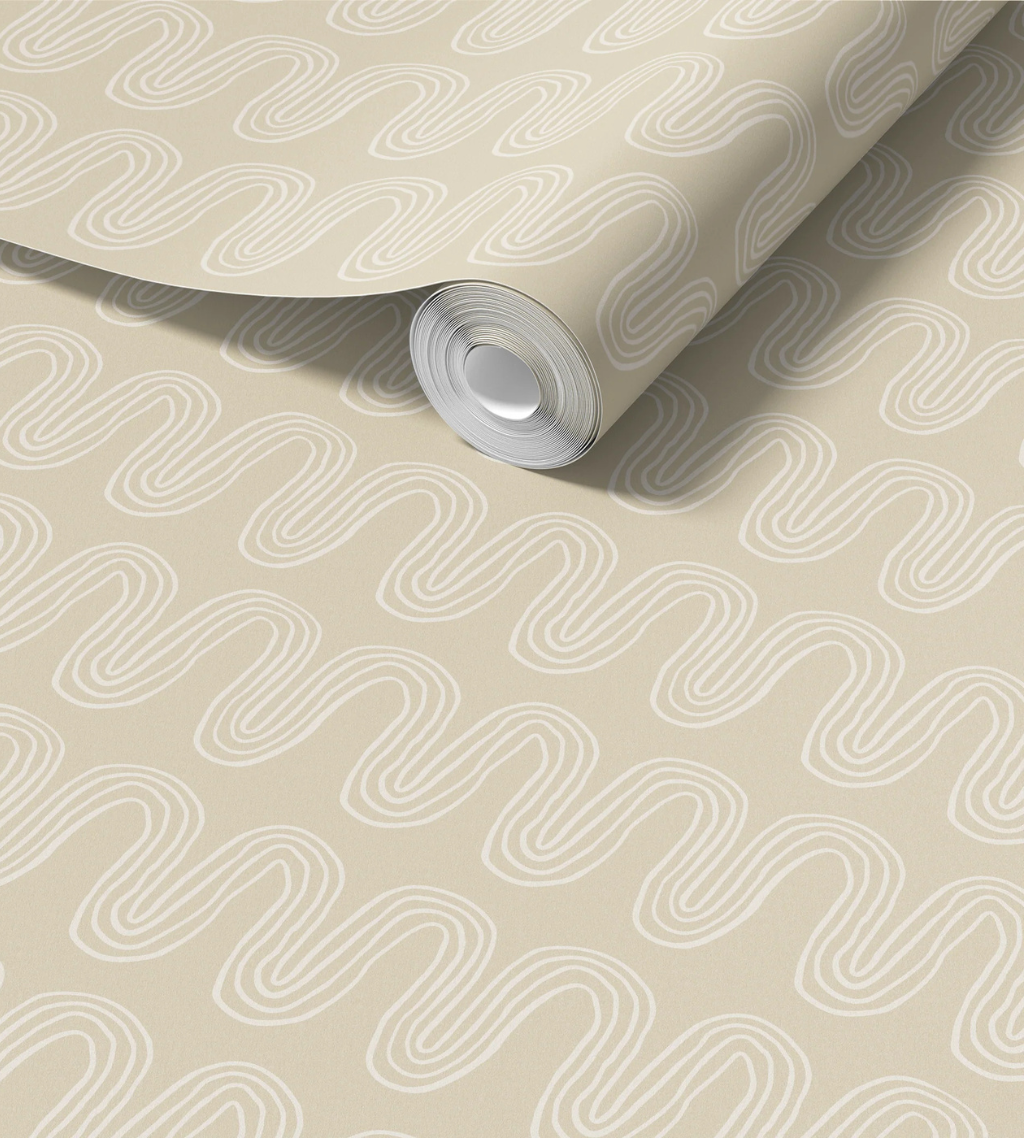
Soft greens, chalky blues, dusty blush and tea-stained taupes are emerging as popular neutrals in home decor.
Neutral used to be shorthand for boring, beige walls. But not anymore. Today’s neutrals are richer, more storied and quietly luxe. Sage, blush and taupe have officially joined the neutral club and they’re not leaving anytime soon.
Despite its best efforts to be trend-proof, even neutral color palettes evolve. In recent history, we watched the warm eggshell and almond interiors of the early 2000s give way to cooler grays and stark whites in the 2010s. Combine this with more open floor plan building and remodeling, all-neutral-everything in every room became the norm.
However, color is slowly creeping its way back into so-called neutral palettes. The throughline? Earth tones that feel calm, cozy and anything but cold. More saturated creams and beiges – especially those with reddish or brown undertones – are taking center stage. Interior design is taking a deliberate step away from the colorless void that ruled the last 20 years in favor of neutrals with a whisper of color.
Neutral isn’t just about color anymore, either. Modern neutral wallpaper leans into texture. Subtle patterns that nod to rattan, jute, pottery or woven textiles keep walls from looking flat and soulless. A soft pattern becomes the easygoing backdrop that lets your furniture, art and personality shine.
Importantly, there’s been a shift in intention. A lot of the neutral walls we grew up with were picked for future buyers or hypothetical renters. The go-to has been safe colors that “everyone” likes and “go with everything.” Today, people are choosing neutrals for the people who actually live there. Think spa-like spaces that please the senses and help the outside world melt away.
If you’re designing for yourself, your neutrals shouldn’t be flat and boring. You deserve better.


If you’re torn between a soft paint color and a neutral wallpaper, you’re not alone. Both can create a calm, livable backdrop. But they go about it in different ways.
Why people love neutral paint:
Why people love neutral wallpaper:
Think of it this way: neutral paint is white noise and neutral wallpaper is a soundtrack. White noise fills the silence, but a great score adds emotion, depth and personality to a film. Wallpaper gives your walls a little something more to say, even if it’s just a whisper. It just depends if you want your walls to fade into the background or quietly steal the scene.


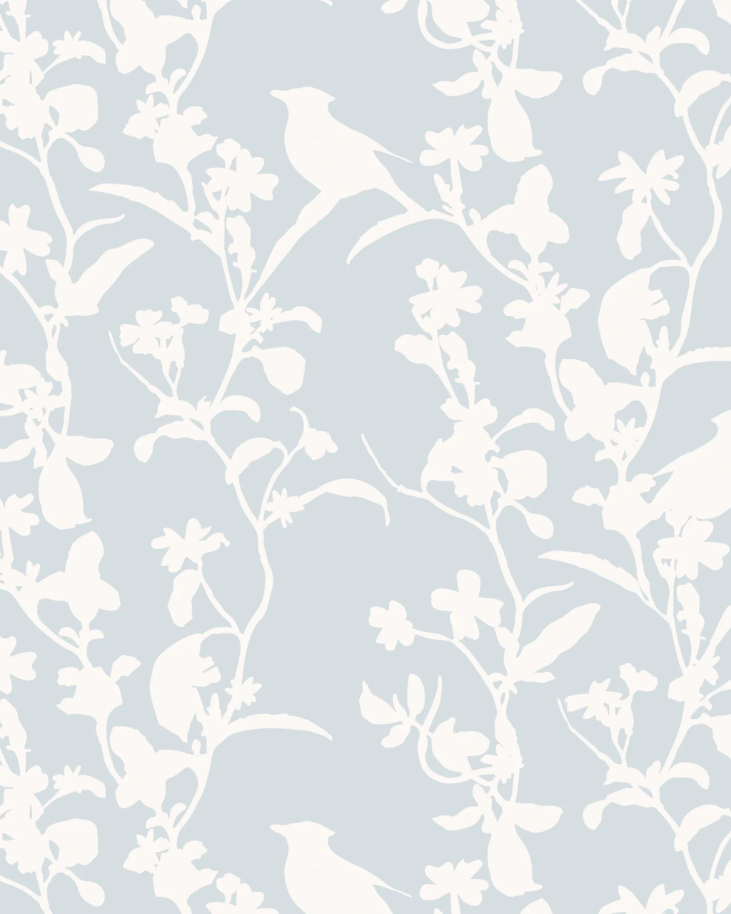
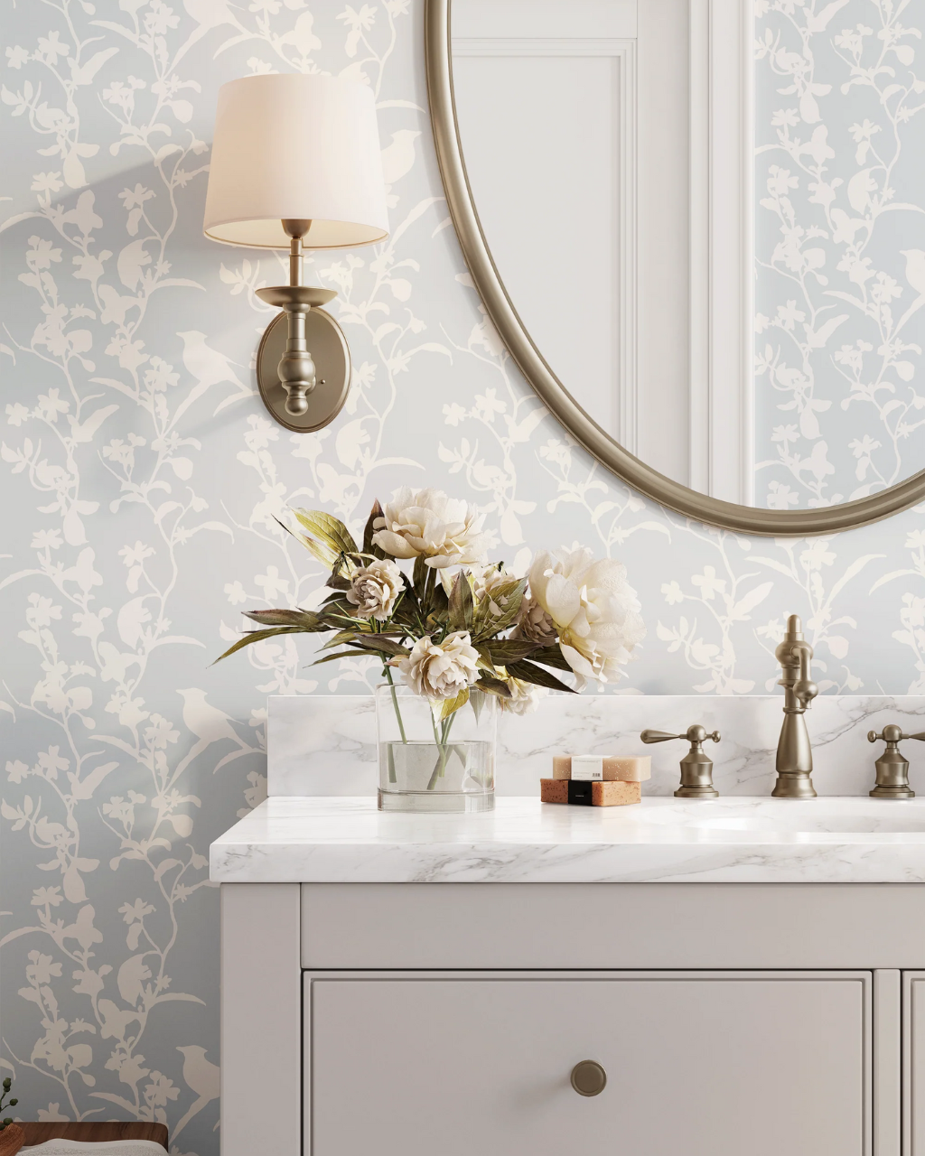
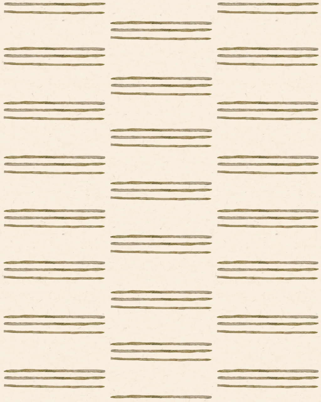
Smaller spaces can handle pattern beautifully, especially when the palette stays neutral. Stone, tile and floral prints in the bathroom are especially popular for creating a spa-like retreat. (Florals for bathrooms? Groundbreaking, we know!) We love wallpaper like Olivia and Line Blossom as neutrals in bathrooms and powder rooms. The sophisticated silhouette of the lines and the low-contrast color palette pairs well with porcelain-white sinks and tubs as well as more colorful towels and decor.
If you’re planning to wallpaper your bathroom, be sure to check out our guide to installing bathroom wallpaper first.


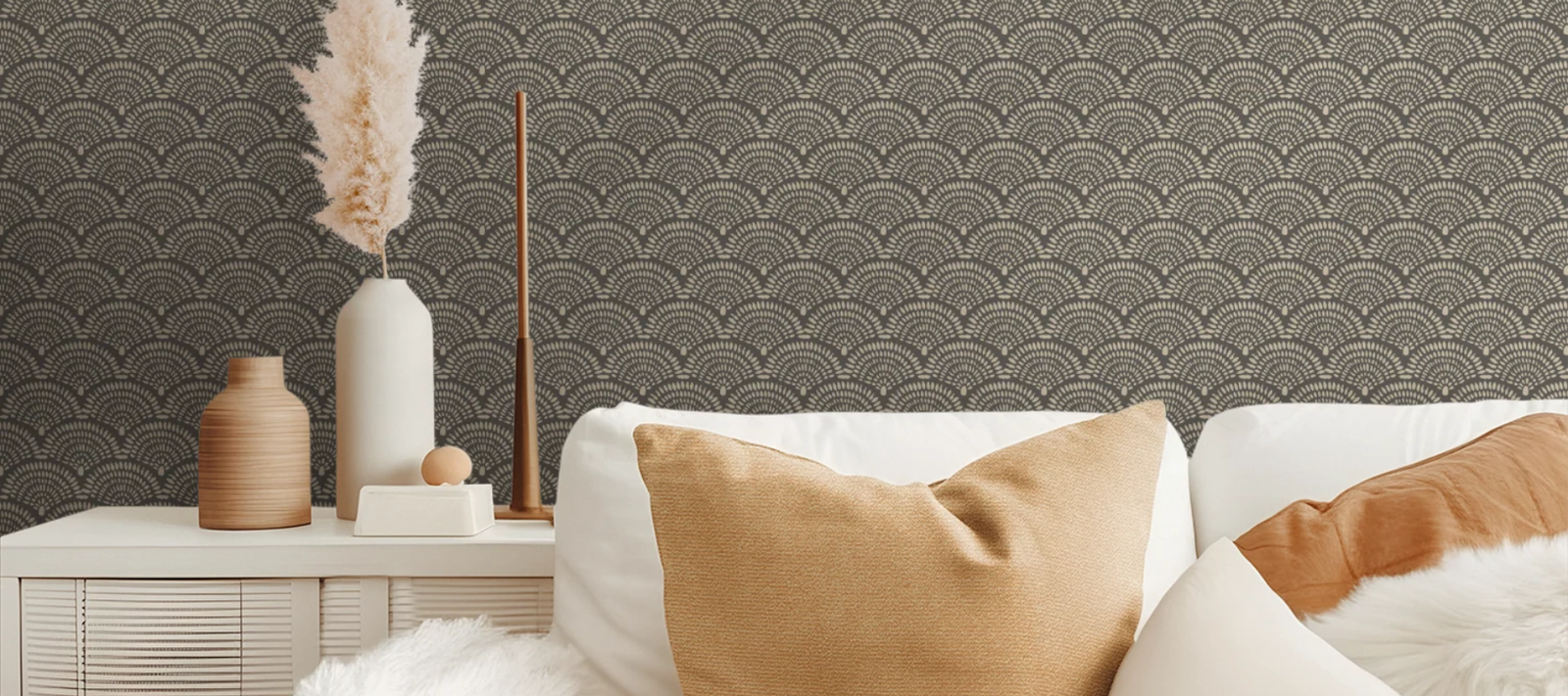
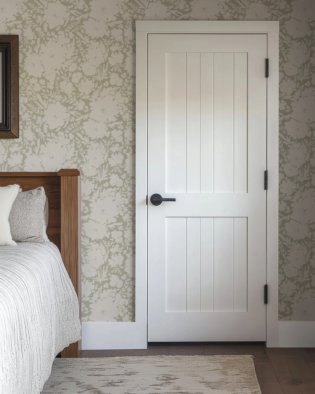
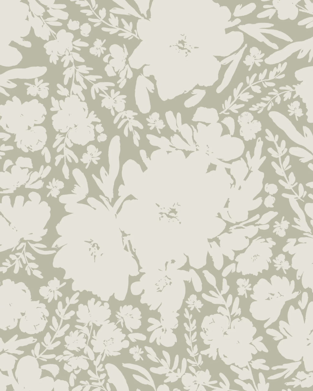
Bedrooms are where neutrals really earn their keep. You want calm, cozy and a little bit dreamy. Oversized florals in soft, low-contrast palettes are perfect here because they add movement without jolting your nervous system. We love wallpaper like Sierra for bedrooms with its quiet silhouettes of beige blooms against a sage backdrop. The softness of the overall effect reads almost like a sponge painted wall – just a lot more sophisticated and a lot less ‘90s DIY. If you’re looking for something on the moodier side of the neutral spectrum, Tulum is gorgeous against white bedding and furniture.
Bedrooms are where neutrals really earn their keep. You want calm, cozy and a little bit dreamy. Oversized florals in soft, low-contrast palettes are perfect here because they add movement without jolting your nervous system. We love wallpaper like Sierra for bedrooms with its quiet silhouettes of beige blooms against a sage backdrop. The softness of the overall effect reads almost like a sponge painted wall – just a lot more sophisticated and a lot less ‘90s DIY. If you’re looking for something on the moodier side of the neutral spectrum, Tulum is gorgeous against white bedding and furniture.


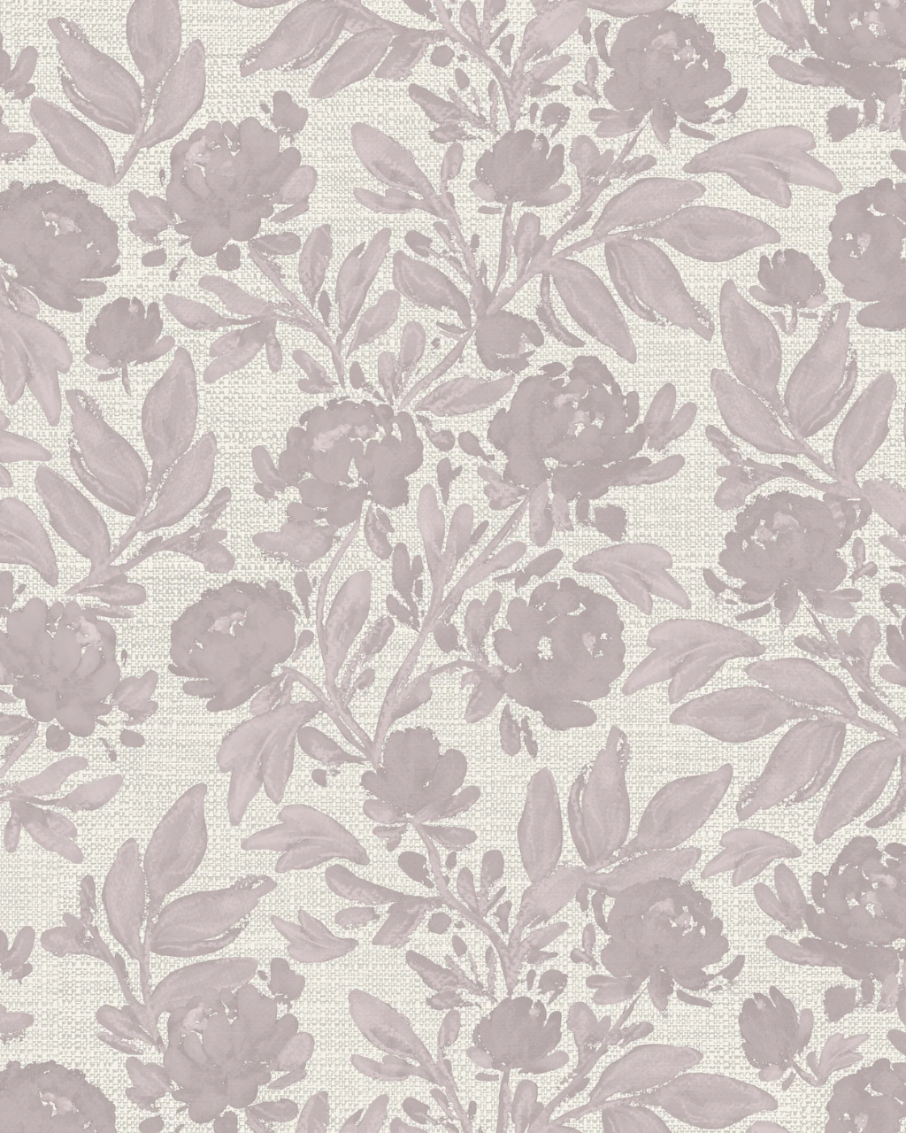
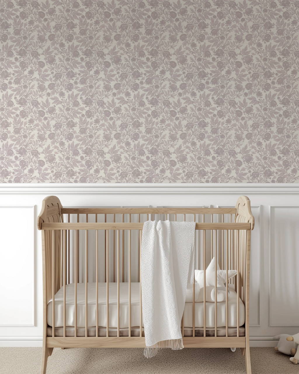
In nurseries, you want something that will feel just as lovely during 2 a.m. feedings as it does in daylight. Neutrals can add a gentle storybook quality without locking you into a super specific color scheme. Patterns like Climbing Roses are a perfect example. The handpainted taupe-pink roses trail across a dynamic linen background, with brushstrokes that feel soft and painterly. It’s the kind of print that looks adorable with a crib and rocker now, and still feels elevated when the nursery morphs into a big-kid room filled with books, toys and personality. The whimsical ocean waves in Sayulita are also a favorite for joyful nurseries.
In nurseries, you want something that will feel just as lovely during 2 a.m. feedings as it does in daylight. Neutrals can add a gentle storybook quality without locking you into a super specific color scheme. Patterns like Climbing Roses are a perfect example. The handpainted taupe-pink roses trail across a dynamic linen background, with brushstrokes that feel soft and painterly. It’s the kind of print that looks adorable with a crib and rocker now, and still feels elevated when the nursery morphs into a big-kid room filled with books, toys and personality. The whimsical ocean waves in Sayulita are also a favorite for joyful nurseries.


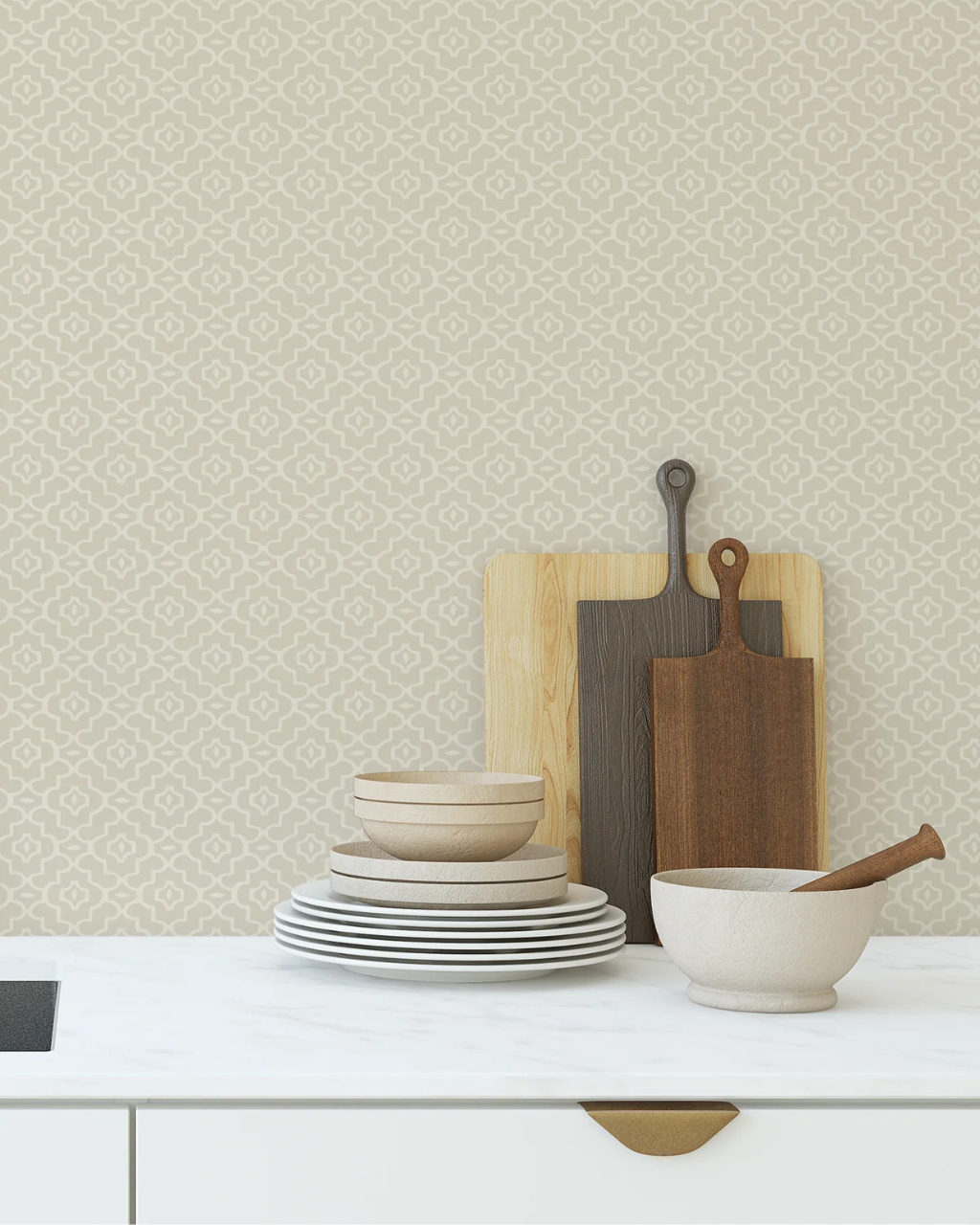
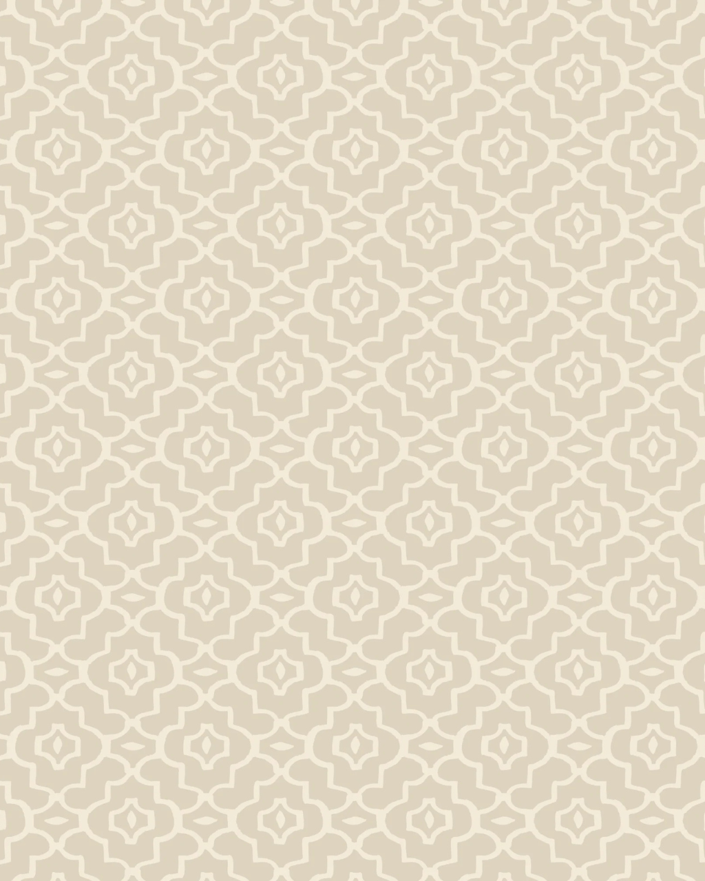
Kitchens are full of hard lines and shiny surfaces, which is exactly why a neutral pattern can make the space feel warmer and welcoming. Instead of another flat coat of paint, a subtle geometric or mosaic print – like Marrakech – adds just enough texture to break things up. This Moroccan-inspired geometric pattern in rich sand and beige tones adds a global sensibility to the room without clashing with your cabinets or backsplash. Consider it your permission slip to experiment with new recipes and flavors!
Kitchens are full of hard lines and shiny surfaces, which is exactly why a neutral pattern can make the space feel warmer and welcoming. Instead of another flat coat of paint, a subtle geometric or mosaic print – like Marrakech – adds just enough texture to break things up. This Moroccan-inspired geometric pattern in rich sand and beige tones adds a global sensibility to the room without clashing with your cabinets or backsplash. Consider it your permission slip to experiment with new recipes and flavors!


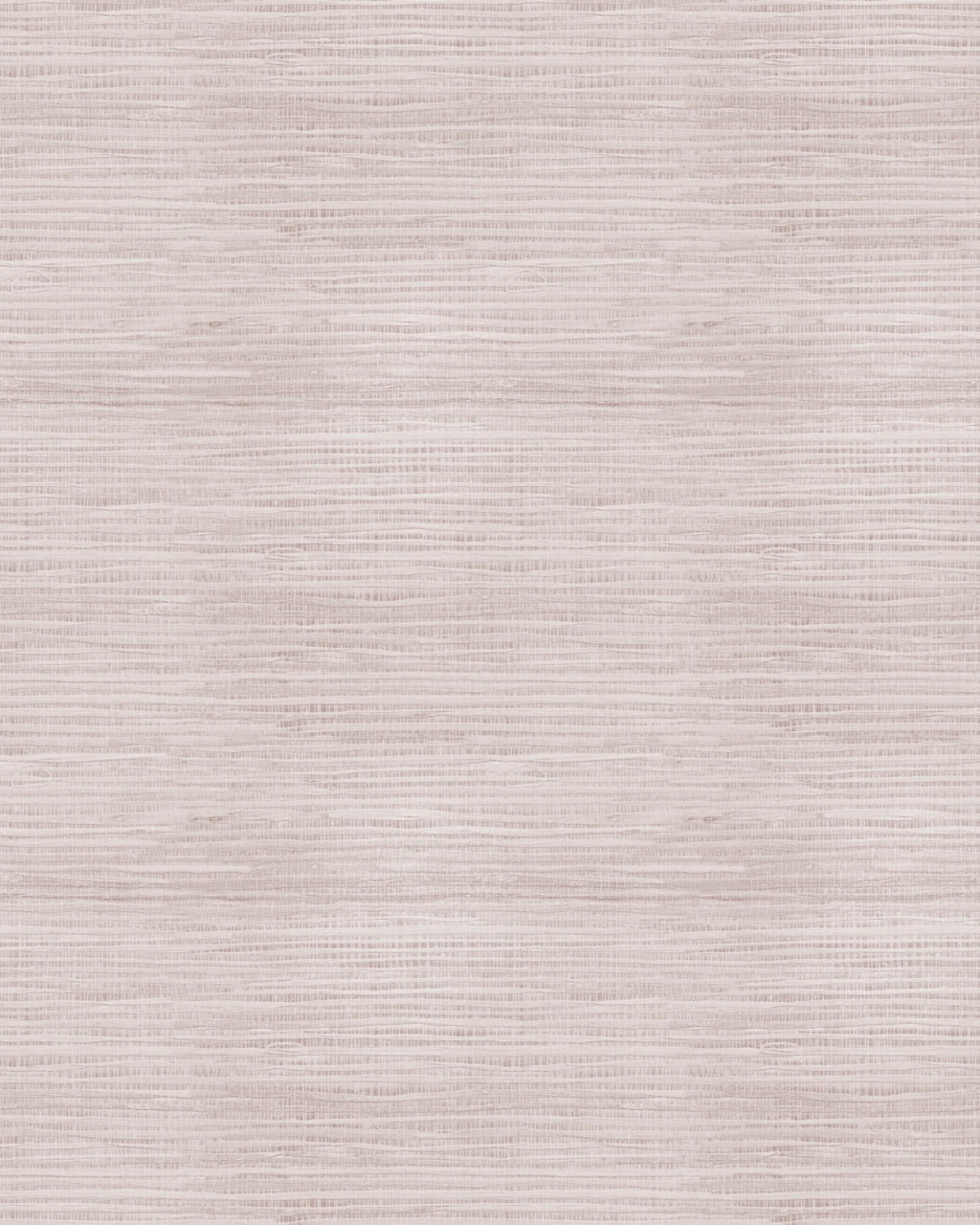
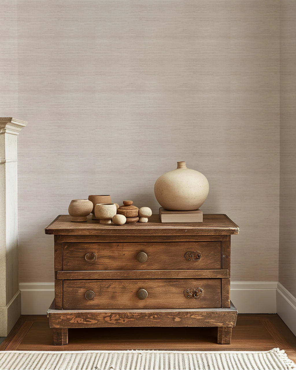
Your living room does a lot of heavy lifting – Netflix nights, rainy day reads, and welcoming visitors that pop by to say hi. It deserves walls that feel as cozy and pulled-together as the rest of the space. Grasscloth wallpaper is designers’ favorite neutral for good reason. Grasscloth adds unexpected texture with a luxe finish. Faux Grasscloth in Rose delivers on the designer look with an extra twist: a whisper of pink woven into its earthy straw tone. It’s subtle enough to still read as a neutral, but just rosy enough to feel current and chic.
Your living room does a lot of heavy lifting – Netflix nights, rainy day reads, and welcoming visitors that pop by to say hi. It deserves walls that feel as cozy and pulled-together as the rest of the space. Grasscloth wallpaper is designers’ favorite neutral for good reason. Grasscloth adds unexpected texture with a luxe finish. Faux Grasscloth in Rose delivers on the designer look with an extra twist: a whisper of pink woven into its earthy straw tone. It’s subtle enough to still read as a neutral, but just rosy enough to feel current and chic.


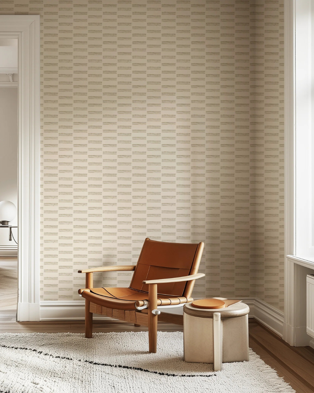
Home offices walk a fine line. You want them to feel calm and grounded, but not so bland that you’re nodding off between emails. This is where a neutral pattern with a bit of structure shines. Patterns like Happy Adventure and Earth nail it with imperfect, hand-drawn lines. The effect is organized but still organic, which gives the space a little extra energy without veering out of the neutral lane. The movement of these designs help to soften masculine office furniture, like dark wood desks and bulky leather chairs. And they’re sure to look great as your new backdrop on Zoom.
Home offices walk a fine line. You want them to feel calm and grounded, but not so bland that you’re nodding off between emails. This is where a neutral pattern with a bit of structure shines. Patterns like Happy Adventure and Earth nail it with imperfect, hand-drawn lines. The effect is organized but still organic, which gives the space a little extra energy without veering out of the neutral lane. The movement of these designs help to soften masculine office furniture, like dark wood desks and bulky leather chairs. And they’re sure to look great as your new backdrop on Zoom.


Dining rooms are all about atmosphere. You want a backdrop that feels special enough for holidays and dinner parties, but not so bold that it clashes with every tablescape you put down. A neutral pattern with a dynamic repeat is the sweet spot. Geometric Floralsdoes this beautifully. Dusty blush and burnt orange petals form a mesmerizing scalloped motif across an off-white, linen-inspired ground. The organic shapes keep it soft, while the structured repeat adds a little architectural rhythm. Thanks to the refined color palette, it still behaves like a neutral – letting candlelight, florals and dishware take center stage. If you have seagrass or rattan cabinets or accents, Kintamani is another favorite in dining rooms to subtly nod to the existing texture.
Dining rooms are all about atmosphere. You want a backdrop that feels special enough for holidays and dinner parties, but not so bold that it clashes with every tablescape you put down. A neutral pattern with a dynamic repeat is the sweet spot. Geometric Floralsdoes this beautifully. Dusty blush and burnt orange petals form a mesmerizing scalloped motif across an off-white, linen-inspired ground. The organic shapes keep it soft, while the structured repeat adds a little architectural rhythm. Thanks to the refined color palette, it still behaves like a neutral – letting candlelight, florals and dishware take center stage. If you have seagrass or rattan cabinets or accents, Kintamani is another favorite in dining rooms to subtly nod to the existing texture.
Going neutral doesn’t mean giving up personality. With the right neutral wallpaper, every room in your home can feel calmer, cozier and more pulled-together without losing that little spark of fun.
Whether you’re warming up a bathroom, softening a kitchen or creating a nursery that can grow with your little one, neutral wallpaper is the quiet hero that makes your everyday shine a little brighter.
Ready to find your perfect neutral? Explore our collection of minimalist (but never boring) wallpaper and start planning your next home upgrade.

Caroline is the owner of Funky Paper Co. What began as a creative outlet is now a full-blown wallpaper wonderland specializing in patterns that are hand-drawn, high-quality and always a little bit funky.
Caroline is the owner of Funky Paper Co. What began as a creative outlet is now a full-blown wallpaper wonderland specializing in patterns that are hand-drawn, high-quality and always a little bit funky.

Wondering if peel and stick wallpaper can survive a laundry room? Here's the honest answer, plus what to look for so it actually stays on the wall.

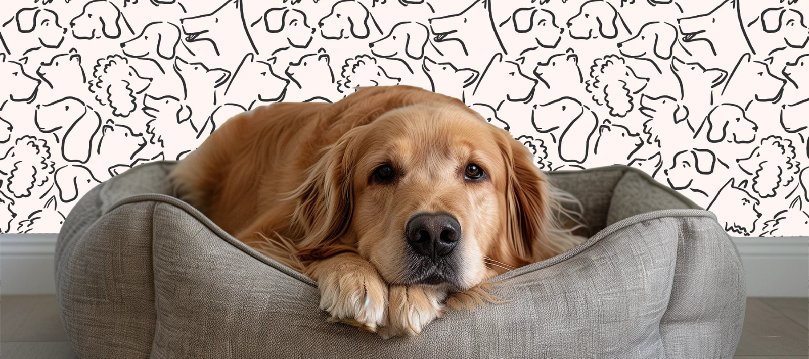
Shop 8 dog (and cat!) wallpaper prints that are purrfect for pet people, from vintage Frenchies to Baroque cat portraits.

Deciding between linen and grasscloth? We break down the differences between linen, faux grasscloth & real grasscloth so you can pick the right material for your space.